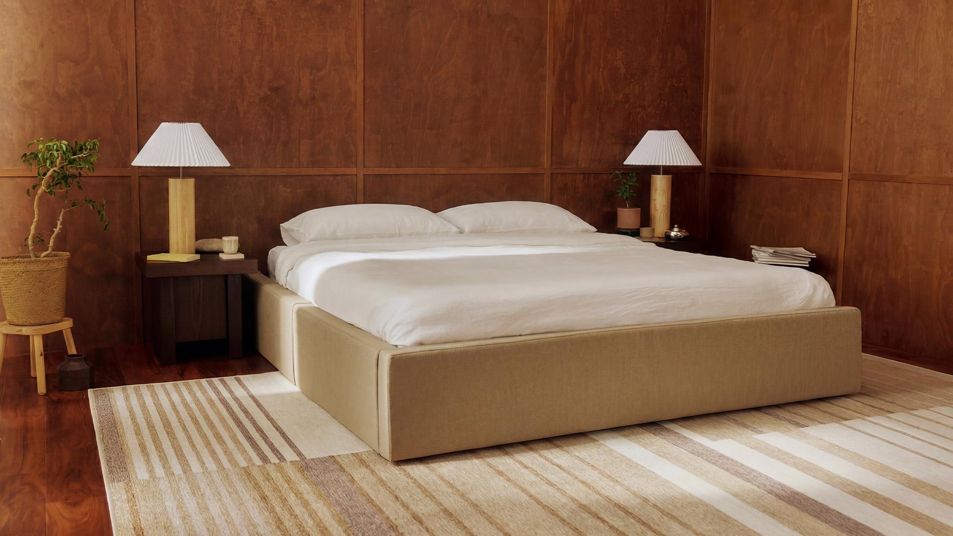
Short answer: The palettes that feel calmest keep contrast low and use two or three close tones. On our Ara bed, the calmest headboard colours are the soft neutrals: Snowdrift, Cloud, Flax Haven, Silken Sand and Crumble. Cobblestone and Sage give a muted, grounded room, and Espresso gives a dark, cosy one. In Canada you can also choose an Oak or Walnut wood finish. Walls and bedding then repeat the same family of tones.
Colour in a bedroom is mostly about what your eye does when you walk in. A bed with a strong contrast against the wall pulls the eye, and a bed that sits close to the wall tone lets it rest. The sections below show how to build that, one layer at a time.
On This Page
- What makes a bedroom palette calm?
- Which Ara headboard colours are calming?
- How do wood finishes change the palette?
- Three calm palettes you can copy
- How do you choose wall and bedding colours?
- Which palette suits your room?
- Our recommendation
- Explore our bedroom range
What makes a bedroom palette calm?
A calm palette is built from a few rules, and all of them are general design practice rather than product facts.
- Low contrast: choose a headboard, walls and bedding that sit within a step or two of each other in lightness.
- Two or three tones: one main colour, one supporting colour and one accent is enough. More than that and the room starts to compete with you.
- Soft, low-saturation colour: muted shades read as quiet, while bright, saturated ones read as lively.
- Texture instead of colour: a chenille headboard against smooth bedding adds depth without adding another hue.
- Light that is warm in the evening: a colour looks different under daylight and under a lamp, so judge it in both.
Our guide to the best fabric for an upholstered headboard covers durability and cleaning for each Ara fabric, so this article stays on colour.
Which Ara headboard colours are calming?
The Ara bed comes in eight fabric colours. We describe them using the wording already on our guides, and we group them here by mood.
- Light and airy: Snowdrift is a clean white, and Cloud is a warm white. Cloud is a bouclé rated at 15,000 Martindale rubs, and we advise spot cleaning it to maintain its look.
- Warm and soft: Flax Haven and Silken Sand are light warm neutrals in Performance Natural Weave, rated at 18,000 Martindale rubs. Crumble is a soft, warm greige in Aquaforte Velvet, rated at more than 200,000.
- Muted and grounded: Cobblestone is a mid grey and Sage is a deep green, both in Performance Chenille, rated at 48,000 Martindale rubs.
- Dark and cosy: Espresso is a very dark brown, also in Performance Chenille.
Lighter fabrics show marks more easily. If the bed is shared with pets or kids, choose a washable cover, and read our guide to bed frames for pets and kids. For the headboard shapes and frames that go with these colours, see our Ara customization guide.
How do wood finishes change the palette?
In Canada, our Ara Wood design comes in Oak or Walnut. Oak is the lighter, more natural finish, and Walnut is deeper and warmer. Both sit on an ash veneer over engineered panels, so the colour is a finish, not a species of solid wood.
Wood brings warmth that fabric cannot, and it ties the bed to the floor, a dresser or a nightstand if you repeat the same tone. Our guide to upholstered and wood bed frames explains the construction and the care of each. If you want a wood bed in a brown tone, our guide to brown beds goes deeper.
Three calm palettes you can copy
Each row below uses only colours and finishes that appear on our Ara page. Walls and bedding are described by mood, because we do not name paint colours.
Three calm palettes you can copy
| Palette | Headboard | Frame | Bedding | Wall mood |
|---|---|---|---|---|
| Light and airy | Cloud or Snowdrift | Round or Square upholstered frame | Warm white and flax-toned linen | Soft warm white |
| Warm and earthy | Flax Haven, Silken Sand or Crumble | Upholstered frame, or Oak (Canada only) | Sand, oatmeal and cream | Pale greige |
| Muted and grounded | Sage or Cobblestone | Upholstered frame, or Walnut (Canada only) | Off-white, with one softer accent | Quiet light neutral |
For a dark, cosy room, use Espresso as the single dark note and keep everything else warm and quiet, as in our guide to brown beds. For a green room, our green beds guide covers Sage.
How do you choose wall and bedding colours?
Start with the headboard, because it is the largest block of colour you will choose. As general advice, not a product specification, keep the walls within a step or two of its lightness, and let the bedding sit between the two.
- Walls: low-saturation shades with a matte or soft finish reflect less glare. Test a sample on the wall and look at it at morning, noon and night.
- Bedding: keep it in one colour family and add one softer accent, such as a throw. Smooth linens against a textured headboard keep the room from looking flat.
- Floor and wood: repeat a tone you already own. If the floor is warm, choose a warm headboard, and if it is cool, a grey such as Cobblestone sits more easily.
Which palette suits your room?
Which palette suits your room?
| Your room | A good direction | Why |
|---|---|---|
| Small or dim | Snowdrift, Cloud or Silken Sand | Light colours keep the bed from feeling heavy |
| Lots of daylight | Most colours, including Espresso | Daylight keeps a dark headboard from feeling heavy |
| Lamp-lit evenings | Warm neutrals such as Flax Haven or Crumble | Warm light flatters warm tones |
| Pets or kids | A washable cover in Crumble or Cobblestone | A washable cover and a mid tone tend to hide everyday marks |
These are suggestions, and the best palette is the one that feels restful to you in your own light. Free swatches let you hold the fabric next to your walls and bedding before you order.
Our recommendation
Pick the mood first, then the colour.
- Choose Snowdrift or Cloud for a light, airy room.
- Choose Flax Haven, Silken Sand or Crumble for a warm, soft room.
- Choose Cobblestone or Sage for a muted, grounded room.
- Choose Espresso for a dark, cosy room with plenty of daylight or warm lamps.
- Choose Oak or Walnut (Canada only) if you want the bed itself to bring wood warmth.
Order swatches for your top two, and decide in the room itself.
Explore our bedroom range
Product specifications can change. Check the current dimensions on the product page before ordering.